In 2023, Travelers Haven conducted an NPS (Net Promoter Score) survey to assess the usability of its portal and gather user feedback on various features. The survey provided valuable insights into user pain points and areas for improvement. Based on this feedback, we initiated a series of “Quick Wins”—small but impactful updates designed to enhance the portal’s functionality and improve the overall user experience. These quick wins focused on quality-of-life improvements that could be implemented efficiently while addressing the most pressing user needs. As the UI/UX Designer on this project, I played a central role in redesigning key features and ensuring the updates aligned with user expectations and business goals. The project was completed within the same year, delivering measurable improvements to the portal.
UX/UI Design
User Research
The NPS survey revealed that while the portal scored in the “good” range, the qualitative feedback highlighted specific areas for improvement. The product team organized this feedback into actionable “quick wins,” prioritizing features that would have the most significant impact on user satisfaction. Some of these updates were straightforward, such as providing training documents for managers, adding new selection options, or fixing minor bugs. However, the most impactful changes focused on five key features: Service Tickets, Payment Center, Option Presentation, Occupancy Agreement, and Move-In Letter. These features were identified as critical pain points for users, and my role was to redesign them to improve usability, transparency, and overall satisfaction.


Overview:
Service tickets were a major source of frustration for users. At the time of the survey, the service tickets feature was an embedded iframe linking to a Salesforce form. This implementation caused numerous issues: the form often failed to load properly, and users couldn’t reference their tickets after submission, leaving them unaware of the ticket’s status or progress.
Design Results:
To address these issues, I designed a dedicated service tickets page that pulled data directly from Salesforce. This new implementation provided users with greater transparency and control. Key improvements included:
• The ability to create tickets directly from their lease or the service tickets tab.
• A table view that allowed users to sort, organize, and track the status of their tickets.
• A detailed service ticket page where users could view ticket details, lease information, upload files, and communicate directly with the team member handling their case.


Overview:
Feedback from the survey indicated that users struggled with managing their payment profiles, setting up autopay, and viewing payment history. The existing payment center lacked clarity and functionality, leading to confusion and inefficiency.
Design Results:
I redesigned the payment center to address these pain points, introducing new tabs such as Manage Autopay and Payments. The updated layout emphasized visual hierarchy, making it easier for users to navigate and understand their payment options. The improved design streamlined the process of setting up autopay and provided a clear overview of payment history, reducing user frustration and improving overall satisfaction.


Overview:
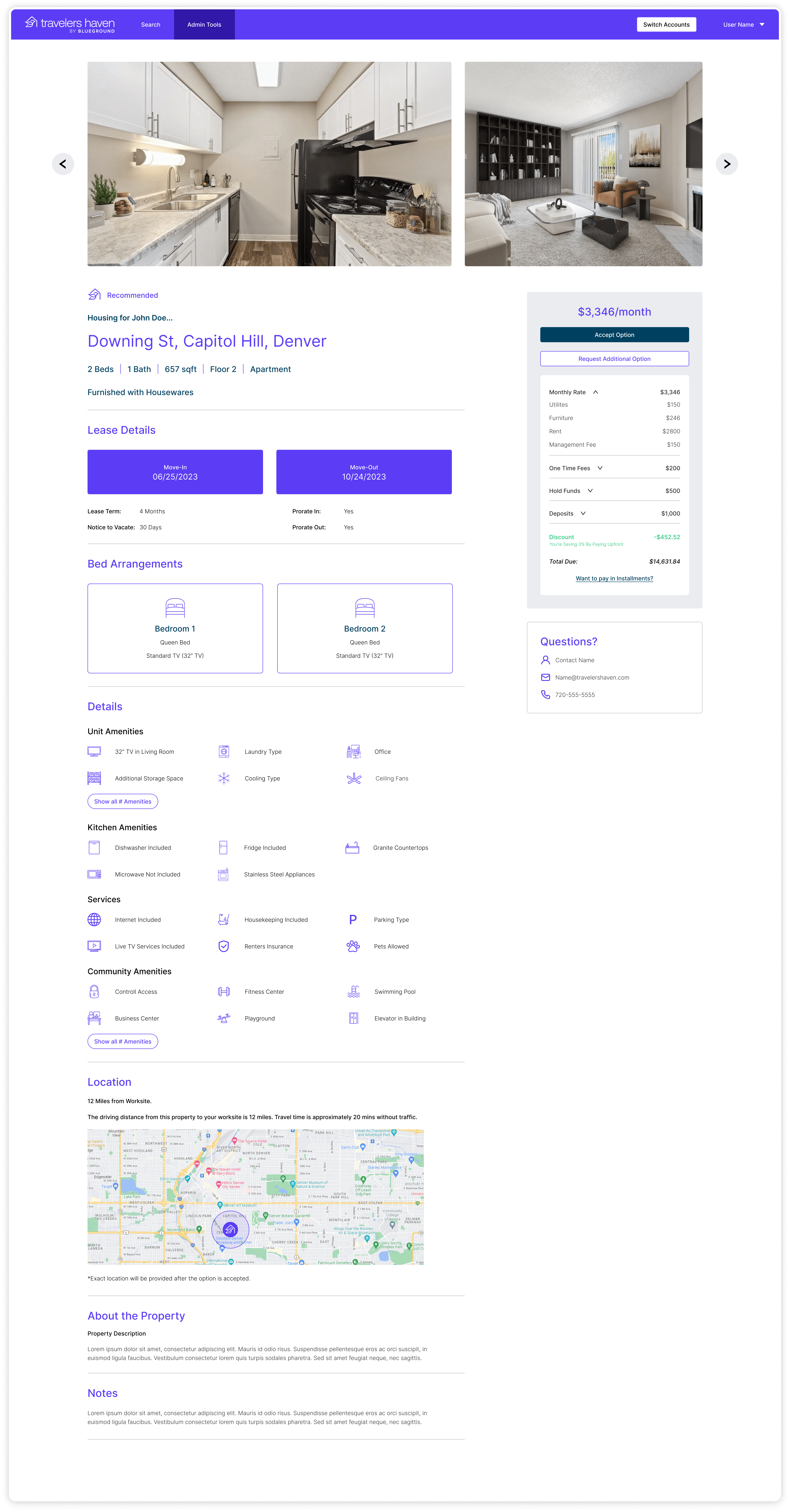
Users expressed dissatisfaction with the option presentation feature, citing a lack of clarity and inconsistency in the information provided. Over time, the design had deviated from brand guidelines, resulting in a disjointed and confusing experience.
Design Results:
I reimagined the layout of the option presentation, creating new components and icons to enhance clarity and consistency. The updated design ensured that all relevant information—such as unit details and pricing—was presented in a clear, uniform manner. This not only improved the user experience but also aligned the portal with industry standards, making it more competitive with other corporate housing platforms.


Overview:
The occupancy agreement process was another area of frustration for users. Clients were required to sign the agreement and then navigate back to the portal to make payments, which often led to billing issues and confusion.
Design Results:
To simplify the process, I redesigned the occupancy agreement into four distinct tabs:
1. Occupant and Unit Details: A clear overview of the unit and occupant information.
2. Terms and Conditions: Easy-to-read terms for signing.
3. Make Payment: A streamlined payment screen for immediate payment and autopay setup.
This redesign eliminated unnecessary steps, reduced billing errors, and provided a more seamless experience for users.


Overview:
Previously, the move-in letter was a PDF sent manually by account managers, leading to inconsistencies and outdated information. Users often received inaccurate details, causing confusion and additional questions.
Design Results:
I designed a live move-in letter feature within the portal, accessible to both occupants and clients. The letter dynamically pulled data from Salesforce, ensuring that all information was accurate and up-to-date. The redesign also included additional unit details that occupants frequently asked about, reducing the need for follow-up communication and improving the overall move-in experience.

The release of these features had a measurable impact on user satisfaction and portal efficiency. Within the first month, the number of users enrolled in autopay increased by 17%, and account managers reported fewer emails and questions about service ticket updates. Additionally, the number of service tickets related to move-in issues and questions decreased significantly. These results demonstrate that the updates successfully addressed user pain points, simplified processes, and improved communication, ultimately enhancing the overall user experience.
This project was a testament to the value of addressing user feedback through targeted, iterative improvements. By focusing on “quick wins,” we were able to make meaningful changes to an existing portal that had undergone numerous changes over the years. This approach allowed us to adapt to evolving user needs and shifting team structures while maintaining a clear focus on usability and functionality. Moving forward, I believe this strategy of continuous improvement and user-centered design will remain essential for keeping the portal aligned with user expectations and business goals.